UX/UI Design
I craft intuitive and visually engaging designs by applying user-centered principles and the latest industry trends. My focus is on creating seamless experiences, clear visual hierarchy, and aesthetically compelling interfaces that align with users’ needs and project goals.
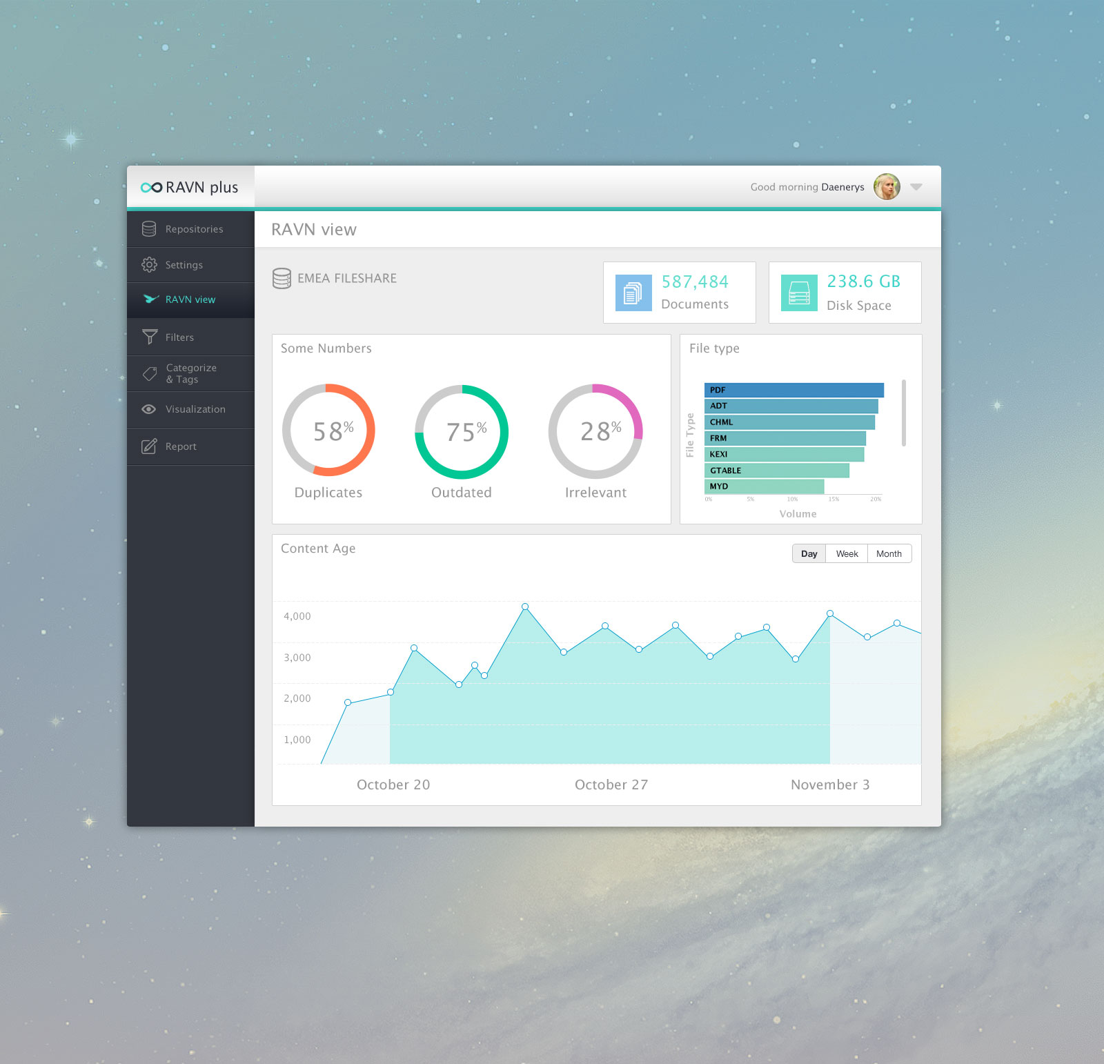
Big Data company
Creation of Company’s website (WP) and maintenance of several web applications. Working in close collaboration with Developers, Marketing and Sales departments, Project Managers, Commercial Directors, CTO and CEO. Conception (design) and implementation (frontend) of one of their unicorn projects. Designing wireframes, prototypes, marketing imagery, banners, logos, cards. Visual design, visual identity, typography, interaction design and animation. Creation of Brand guidelines intranet (CodeIgniter) Conception of new landing pages for some of their products.
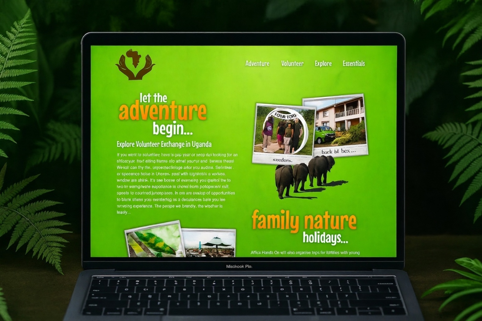
Web and Logo Design
Designed a custom website and logo for a tourism company, focusing on building a strong brand identity and engaging user experience. Worked closely with stakeholders through successive meetings and feedback sessions, refining the logo through several iterations to ensure it effectively represented the company's vision and values. Developed detailed wireframes and prototypes to outline the website's structure and user flow, ensuring intuitive navigation and accessibility. Created imagery, iconography, and visual elements that reflect the company’s brand personality and mission, maintaining consistency across all design components. Completed the project by delivering a cohesive visual identity that enhances the company's online presence and supports its growth objectives.
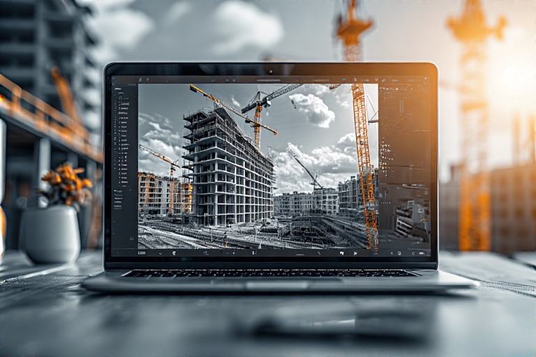
Construction
The redesigned website offers a comprehensive set of benefits that significantly enhance user experience, visual appeal, and functional clarity. Here's an analysis of its key advantages: 1. Clear and Logical Layout: The new design organizes content into distinct sections—overview, features, and client benefits—making it easy for visitors to navigate and find relevant information quickly. The use of visual hierarchy guides the eye seamlessly through the key messages. 2. Improved Space Utilization: With a thoughtfully spaced layout, the website avoids clutter, giving each element room to breathe. This enhances readability and prevents information overload, creating a clean and professional appearance. 3. Visual Engagement and Focus: Large, high-quality images paired with concise, impactful text draw attention to core offerings. The prominent use of imagery related to project management and construction immediately communicates the company's domain and expertise. 4. Enhanced Readability: The use of ample white (or negative) space around text blocks and images improves legibility. Clear font choices and well-organized sections enable users to scan the content efficiently, reducing cognitive load. 5. Mobile Responsiveness and Flexibility: The design highlights compatibility with various devices such as tablets and smartphones. Features like mobile-friendly workflows and adaptable layouts ensure consistent user experiences across platforms. 6. User-Focused Content Sections: Features like “Bespoke,” “Mobile,” “Savings,” and “Handheld” are presented as individual benefit blocks, making it straightforward for visitors to understand the practical advantages—such as ease of use, cost savings, and flexibility. 7. Modern Aesthetic and Professional Feel: The visual style is sleek and contemporary, emphasizing the company’s innovation and reliability. The sophisticated layout instills confidence and positions the brand as a leader in BIM compliance solutions. 8. Call-to-Action and Engagement: Strategic placement of contact info and a prominent “Learn more” button encourage user interaction, converting visitors into potential clients. 9. Efficient Use of Space for Content Delivery: Stacked images and text blocks are balanced to maximize information transmission without overwhelming users, supporting quick comprehension and encouraging further exploration. 10. Consistency and Brand Identity: The consistent color scheme, fonts, and image style reinforce the company's branding, creating a cohesive professional identity. Overall, this website redesign transforms a cluttered, hard-to-navigate interface into a streamlined, engaging, and user-centric platform that highlights the company's key benefits while providing a pleasant and effortless browsing experience.